The Full Story Behind Our Logo
ONE OF THE EARLIEST LOGO CONCEPTS I COULD FIND. WOW IS THAT BAD.
Logo design can be challenging. Finding the perfect balance of imagery and typography that fully embodies the organization it’s representing is no short order. I find it especially difficult when I’m designing for myself. Mostly because I despise myself as a client. If I were able to fire myself, I absolutely would. I’m demanding and have high expectations of what my finished project should look like. So yea, I would fire the crap out of myself, or make myself go broke through change order fees. This is why it should come as no surprise that it took me the better part of six years to design our logo.

EARLY HUNCHBACK SKETCHES BY BILL SENCIO & ANGEL PIMENTEL.
When Hunchback Graphics started out, I was just a dumb kid trying to design t-shirts and album covers for my friends bands. I wanted our brand to be cool and tough, just like I was (not, but I didn’t realize this at the time). I tried my hand at a number of options, but nothing was working for me. So I enlisted an array of friends to sketch me up concepts. For a while, it felt like we were changing logos every couple of months.

EARLY HUNCHBACK SKETCHES BY JOHNNY ATTRIDGE & JESSIE LEE
Right around the time Dan and I partnered up and got serious, we received a series of sketches from my good friend Jeremy Schilling. It embodied the rough & tough guy feel I thought the company should have, as well as used something not so blatant as just the Hunchback head. It felt like we finally had found our mark. We used this on all our branding in the early days, but realized that our focus was all wrong.

BELL AND HUNCHBACK DRAWN BY JEREMY SCHILLING.
It occurred to us around our fourth year that despite how much fun designing for musicians can be, they rarely had the kind of money that would help us sustain a business. So we switched gears, changing our target market from musicians to small business owners. Of course with this change came a new round of retooling for the logo. This time, I promised myself it was going to be my creation. No more giving up on myself, no more crappy excuses. So I dug in hard, exploring all the symbolism I could imagine.

SIMPLISTIC STYLE LOGO USING AN ARCH TO REPRESENT
THE HUNCH.

LESS SIMPLE LOGO USING THE EYE AS THE IMAGE. NO ME GUSTA.
After developing a series of cleaner, more polished designs, knew that I was on the right track. I also knew the final logo was going to be simple, but I was hung up on using a hunchback’s face. To alleviate this hang up, I tried to go as far from my original concept as I could. Turns out it was the best decision I could have made.
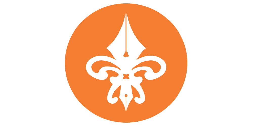
OUR FLEUR-DE-LIS SYMBOL
After many years, many iterations, and a lot of hours spent thinking about the symbolism of Hunchback Graphics, we’ve finally found an emblem as intricate as we are. I’ll gladly explain. From a distance, the image appears to just be a fleur-de-lis, a symbol common in France during the time of The Hunchback of Notre Dame. If you move closer, you’ll notice the two traditional calligraphy pen nubs as well as crossing french curves. These are traditional tools that we still use in our current processes. The fun doesn’t stop there though. In the center of the top pen nub is a bell, and not just any bell. That’s an outline from the bell of Notre Dame, rang daily by our namesake. And lastly, snuck way down low in the bottom pen nub is the shape of an apple, a small nod to our favorite modern tools, and how we do a majority of our work now. I know, it’s deep. We’re really proud of that.
THIS IS OUR CURRENT HUNCHBACK GRAPHICS LOGO
After an extensive type study, we found that our new symbol paired wonderfully with the Nexa typeface. From there, we did some color tests and found that orange felt invigorating, like we we’re trying to be for our clients. The color choice makes the finished design feel like there is knowledge and experience to go along with our youthful enthusiasm.
We’re not telling you all this just to pat our own backs. This is how much thought and consideration goes into every project we work on. We make our designs perfectly embody the passions and expertly communicate the values of our clients to the marketplace.